RECENT WORKOverview
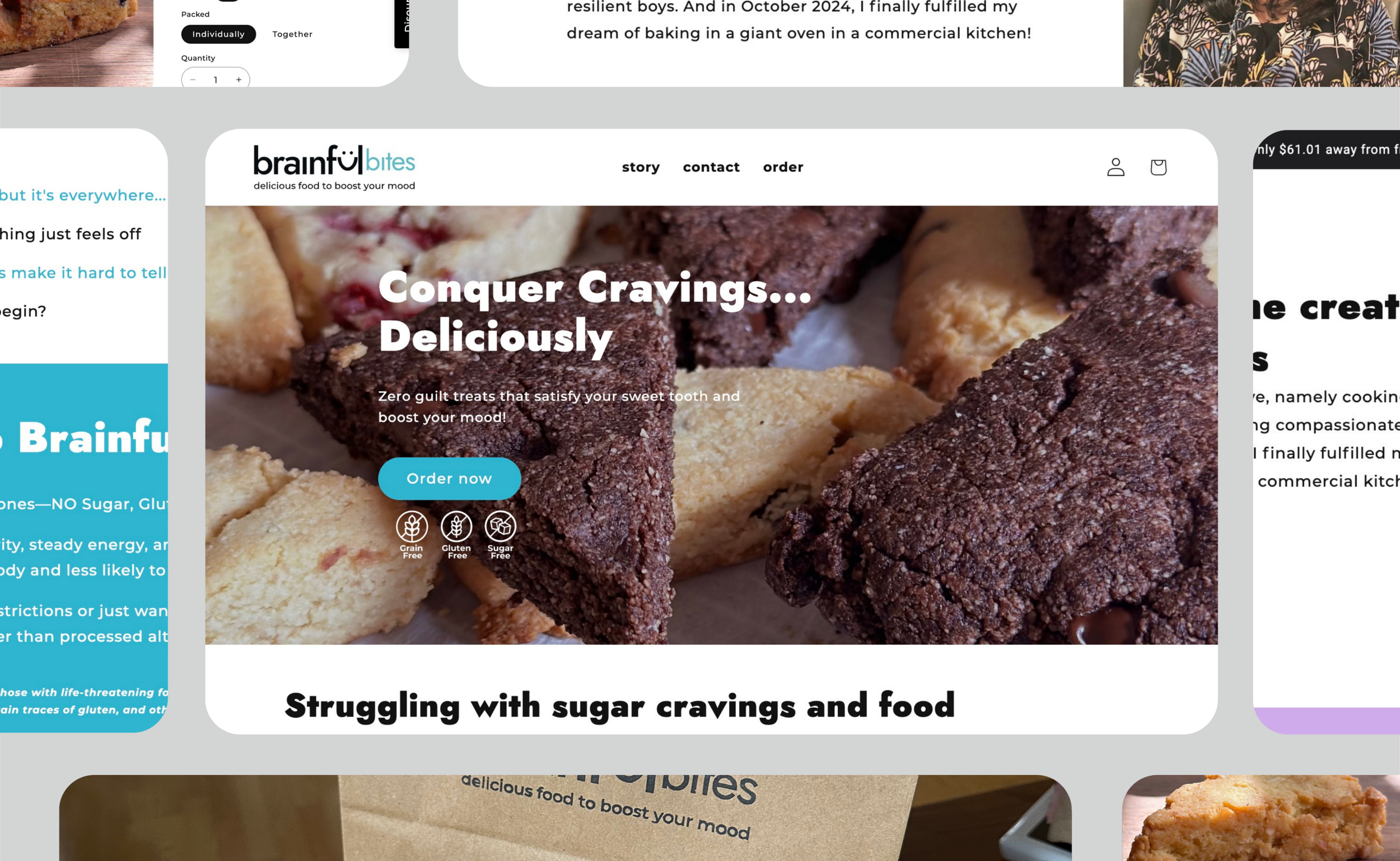
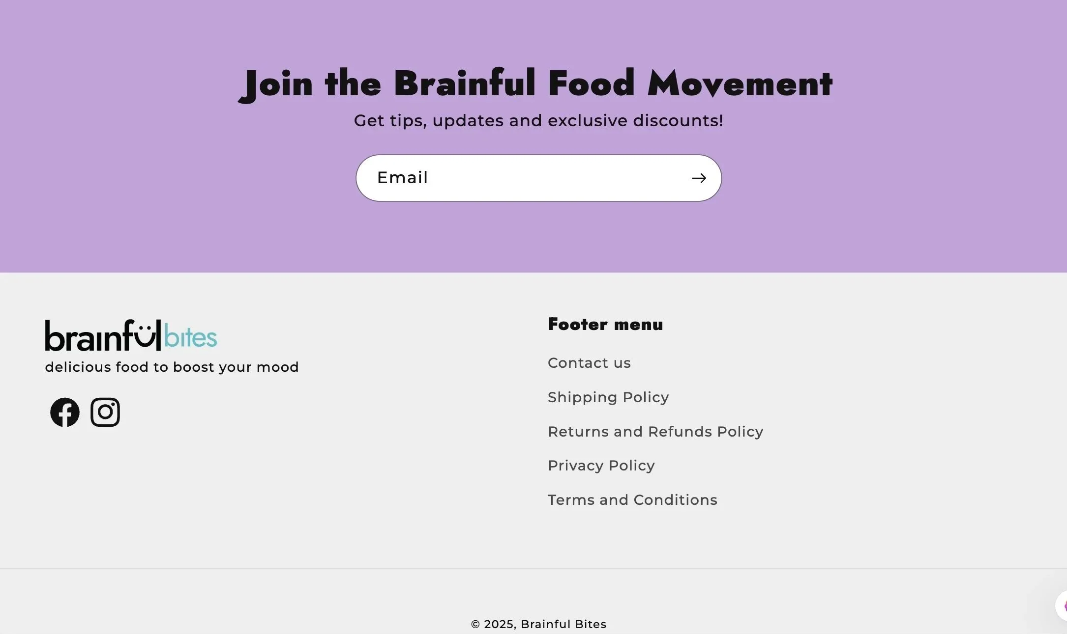
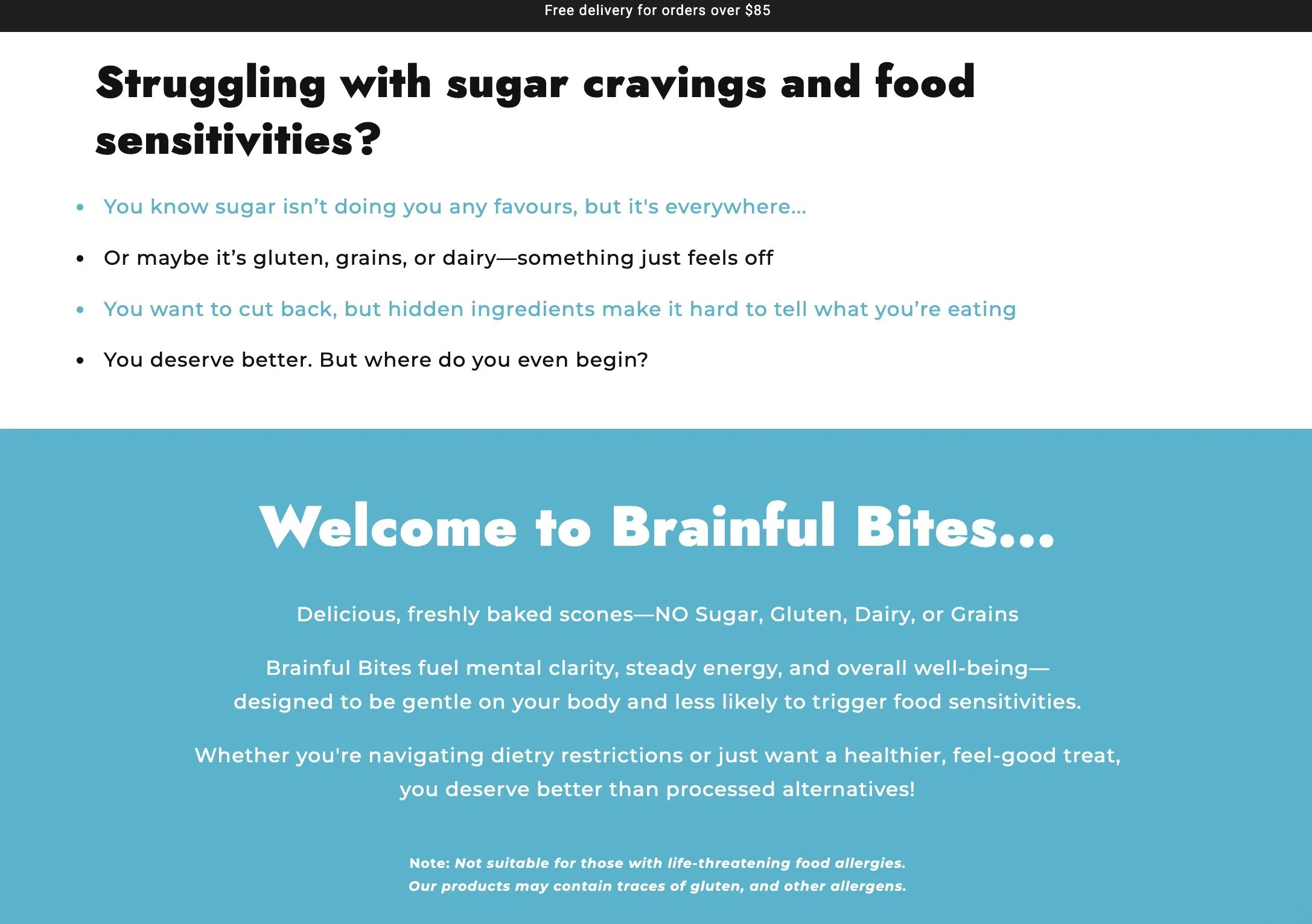
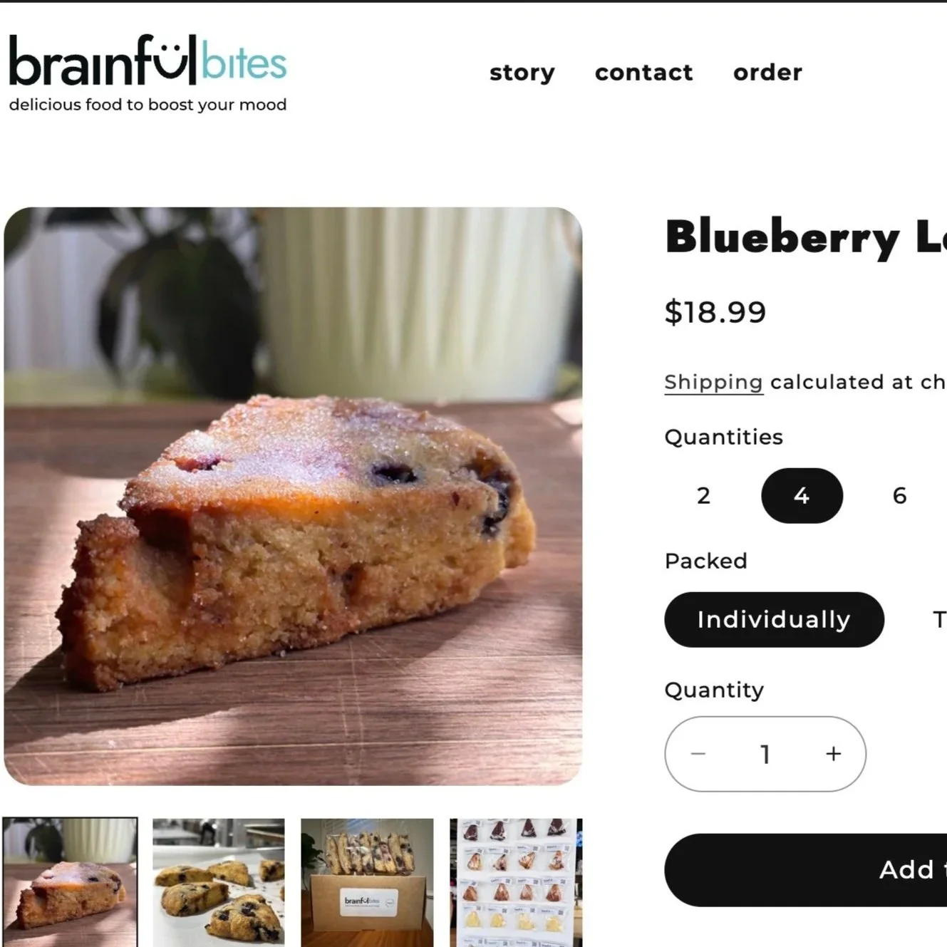
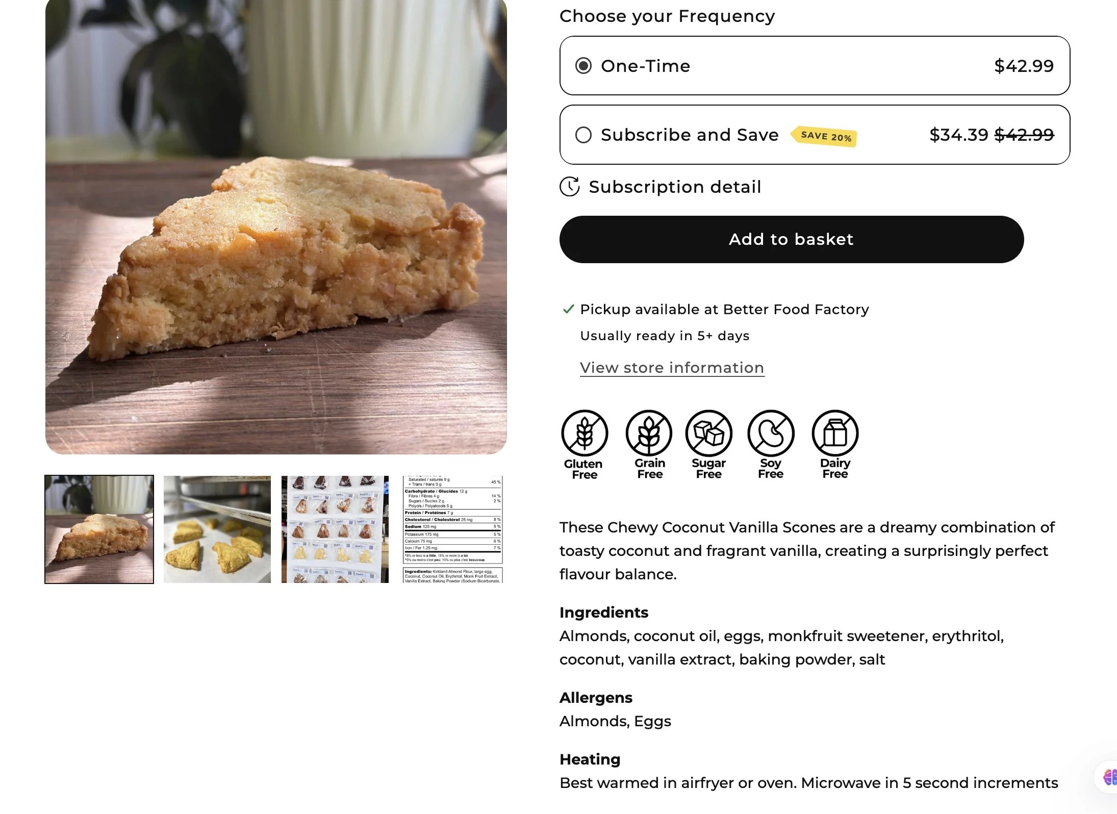
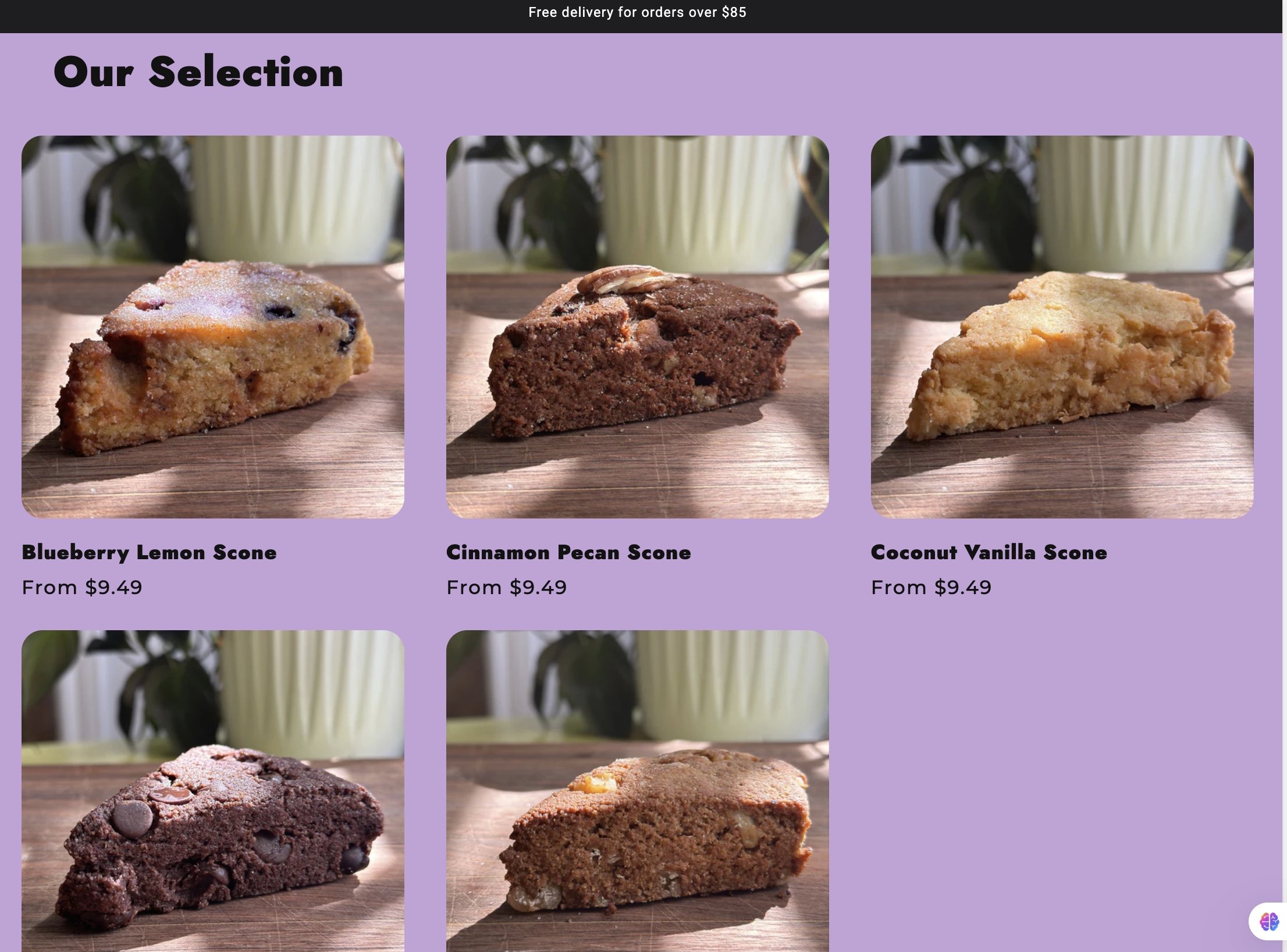
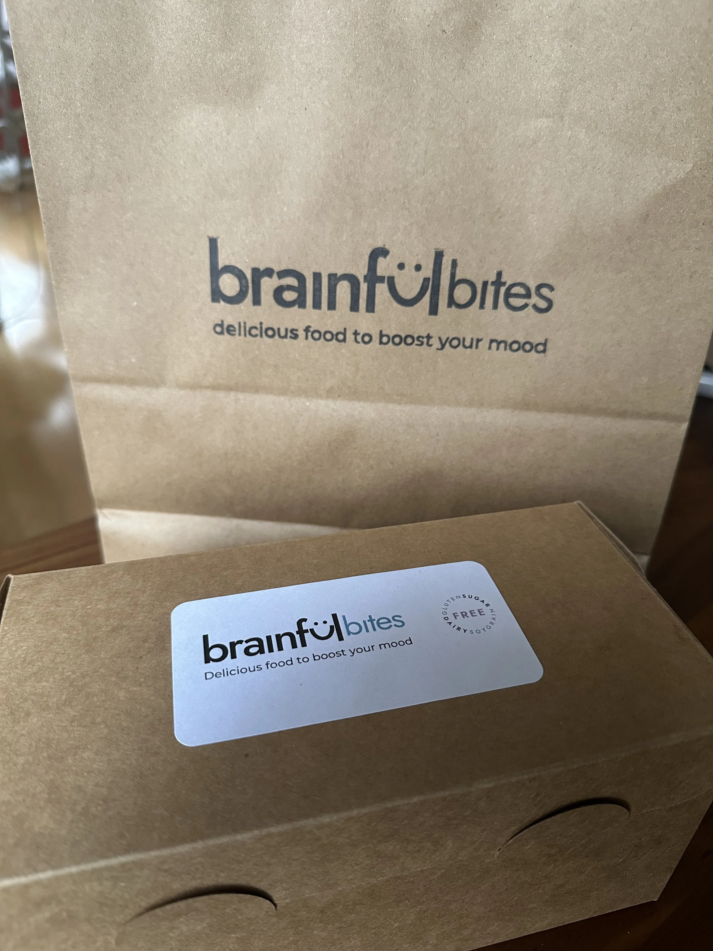
Brainful Bites was a Shopify-based e-commerce store I created and ran for my low-sugar baking business from January to July last year. I developed the brand and product concept, designed the packaging, built the Shopify website, and managed the online store before pivoting into web design.
Running the business gave me first-hand insight into how customers move through an online store, what builds trust, and how clarity and structure influence purchasing decisions.
Brainful
Bites
shopify store and identity
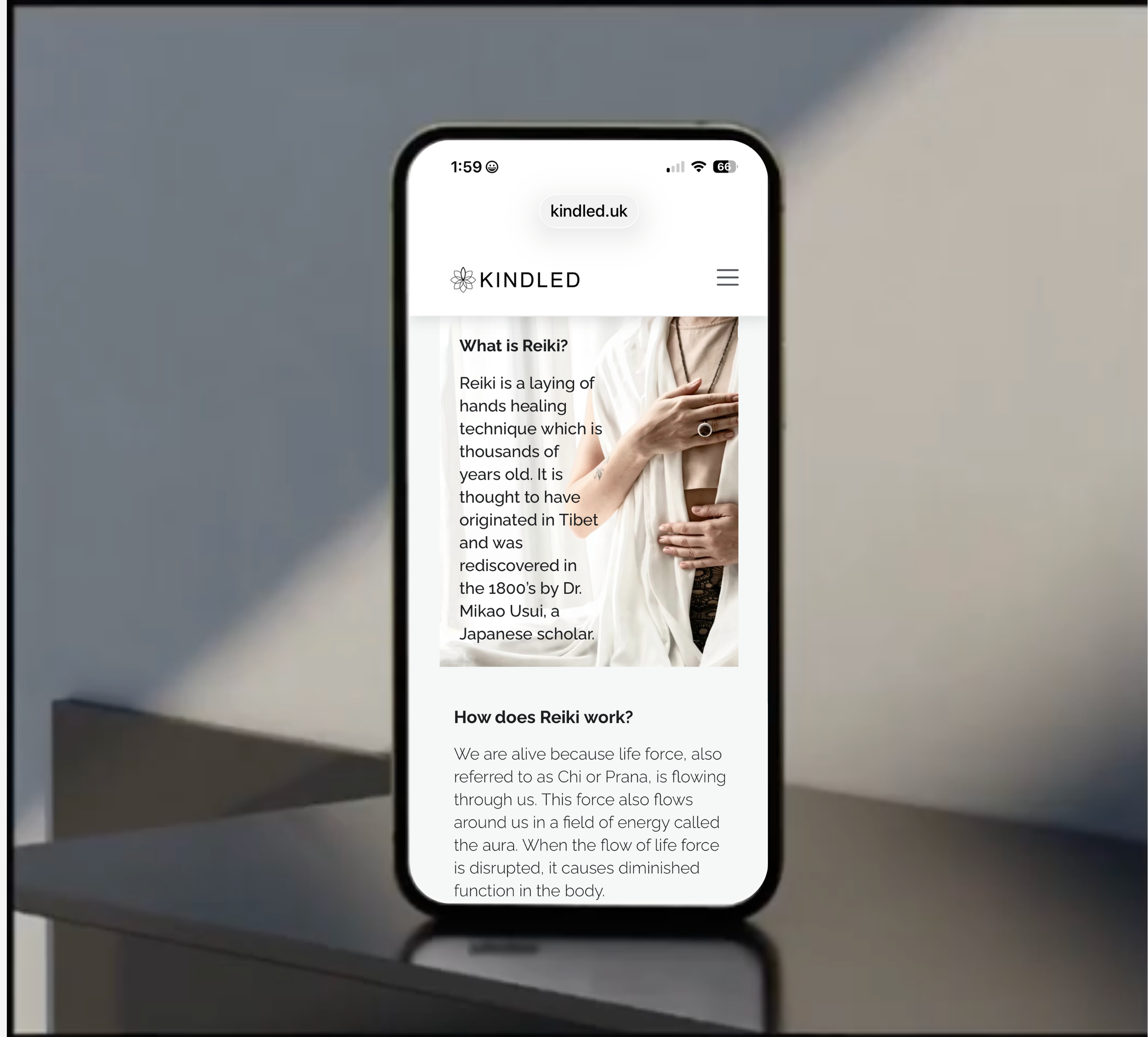
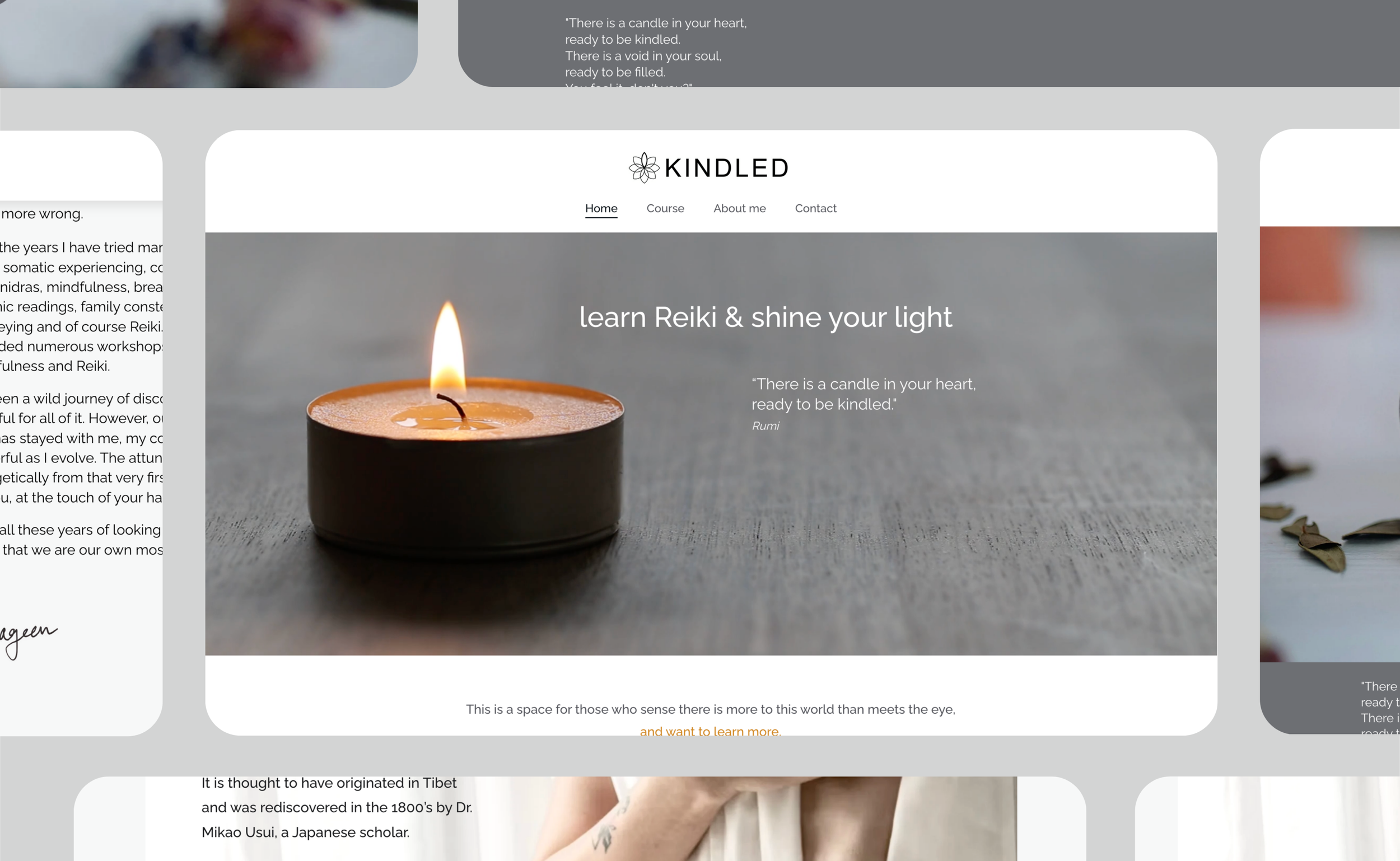
Kindled
website and identity
Overview
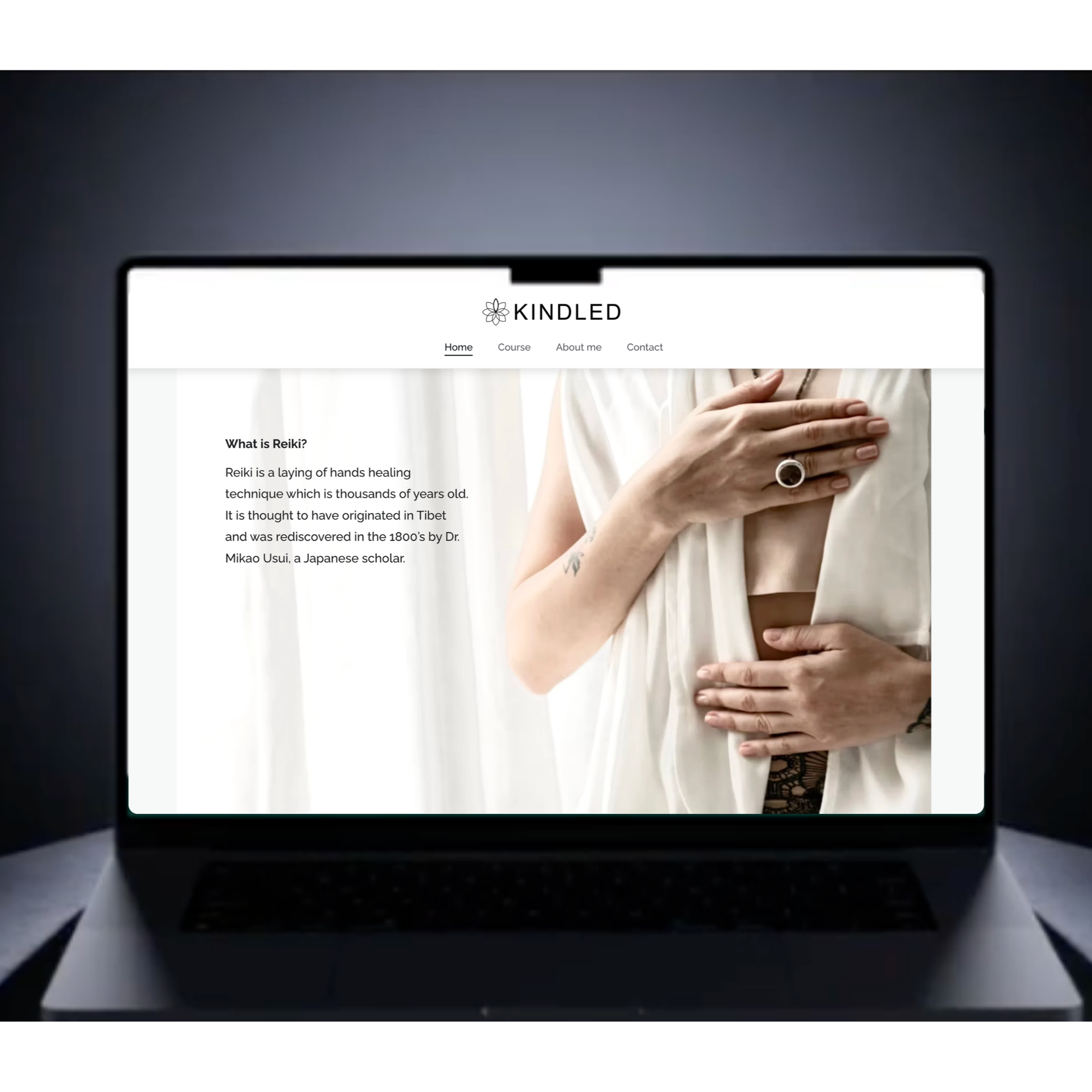
The client was starting from scratch: no website, logo, or online presence. The goal was credibility while keeping the site personal and grounded, without becoming vague or overly mystical. Working closely with the client, we refined her messaging and I introduced a calm visual language and elegant content hierarchy to create a spacious, confident site. Each design decision was intentional to reflect her vision. The result was an aligned online presence the client proudly shared, generating enquiries and new opportunities.
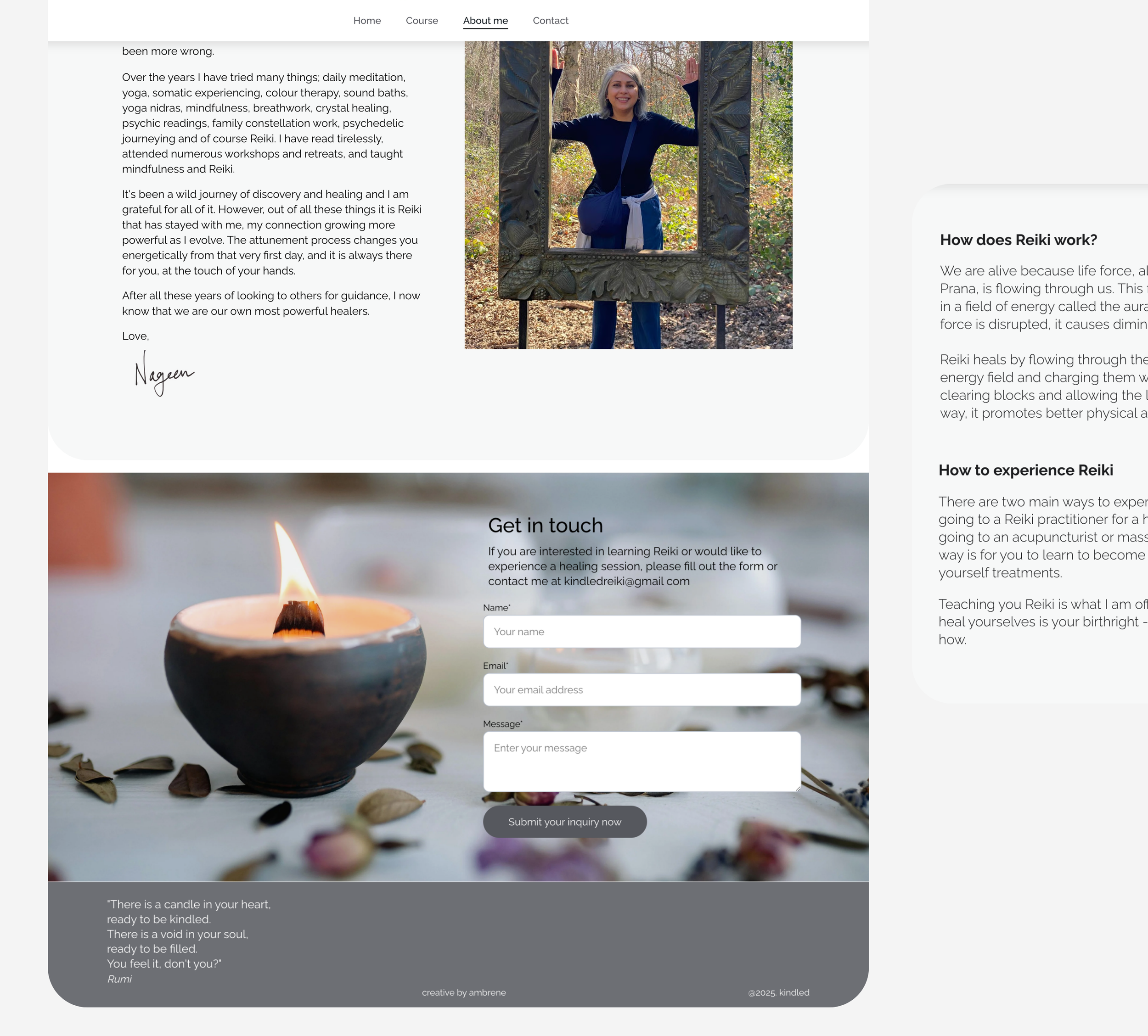
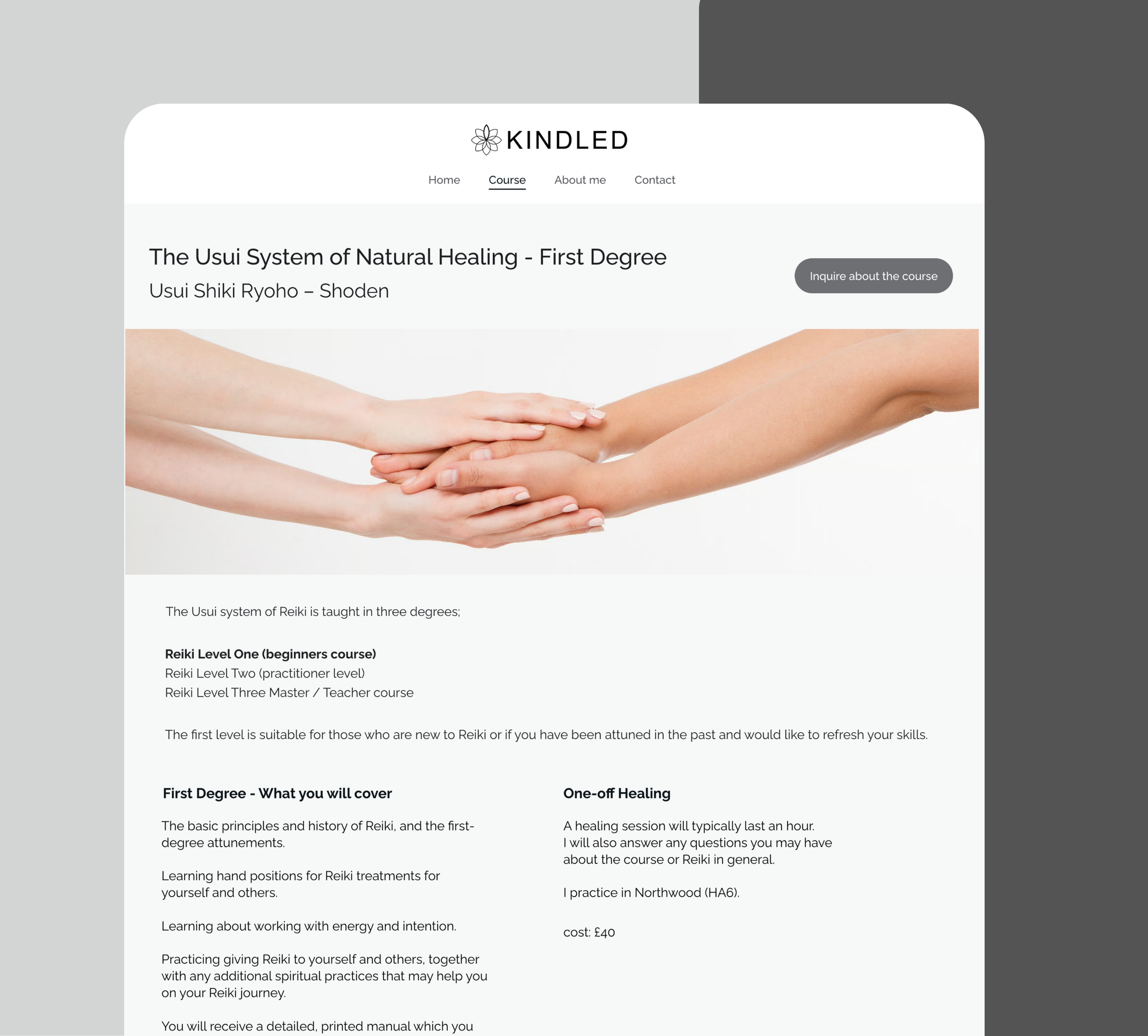

“I really understood why each change was made and how it improved my site. It felt like a true co-creation, and I learned a lot along the way.”
Overview
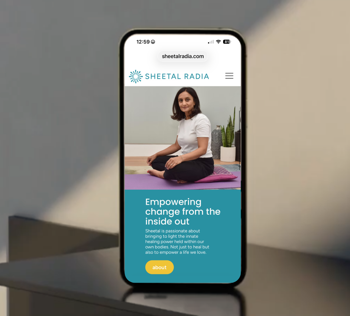
The client needed her first professional website to coincide with her book launch, credible, calm, and aligned with her work. The starting point was a text-heavy draft with no hierarchy, branding, or focused message. I refined the messaging, introduced a cohesive identity system with clear visual hierarchy, and created supportive calls to action. Through a collaborative process, the client understood each decision, resulting in a structured, confident website she could share with ease.
Sheetal
Radia
website and identity
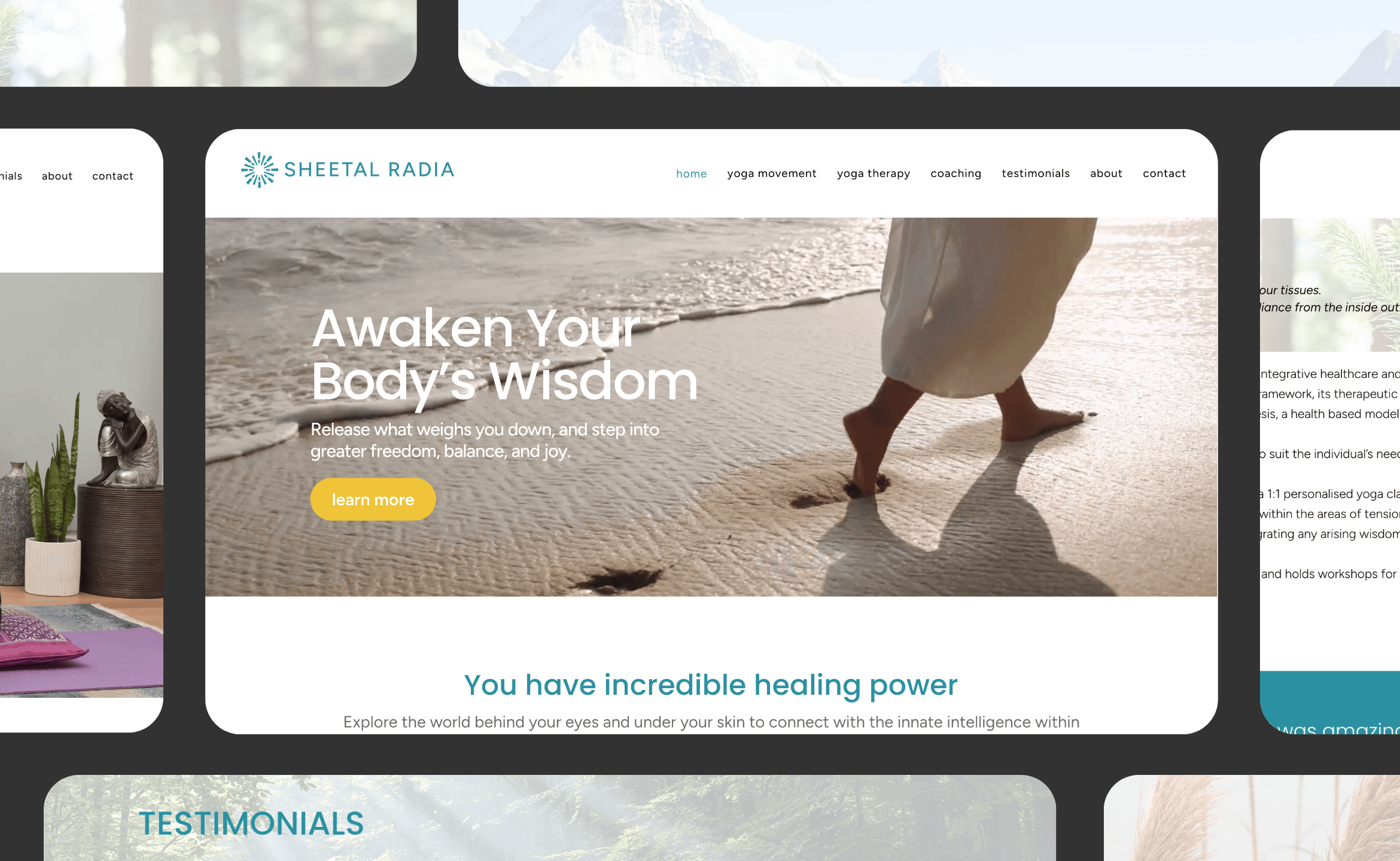
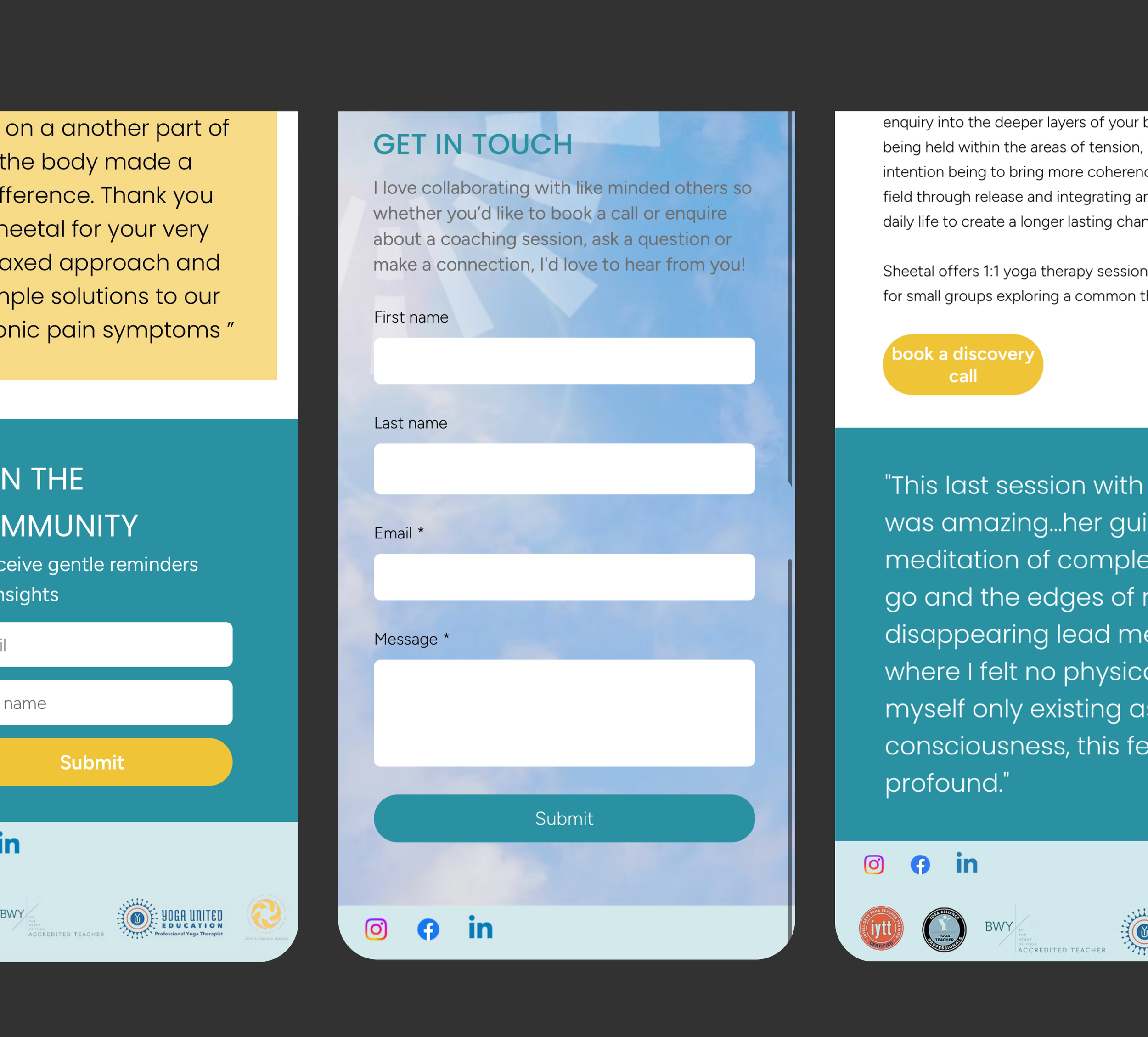
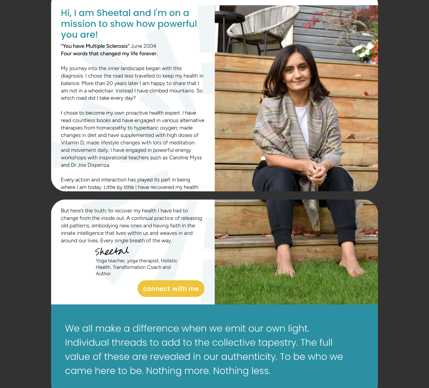
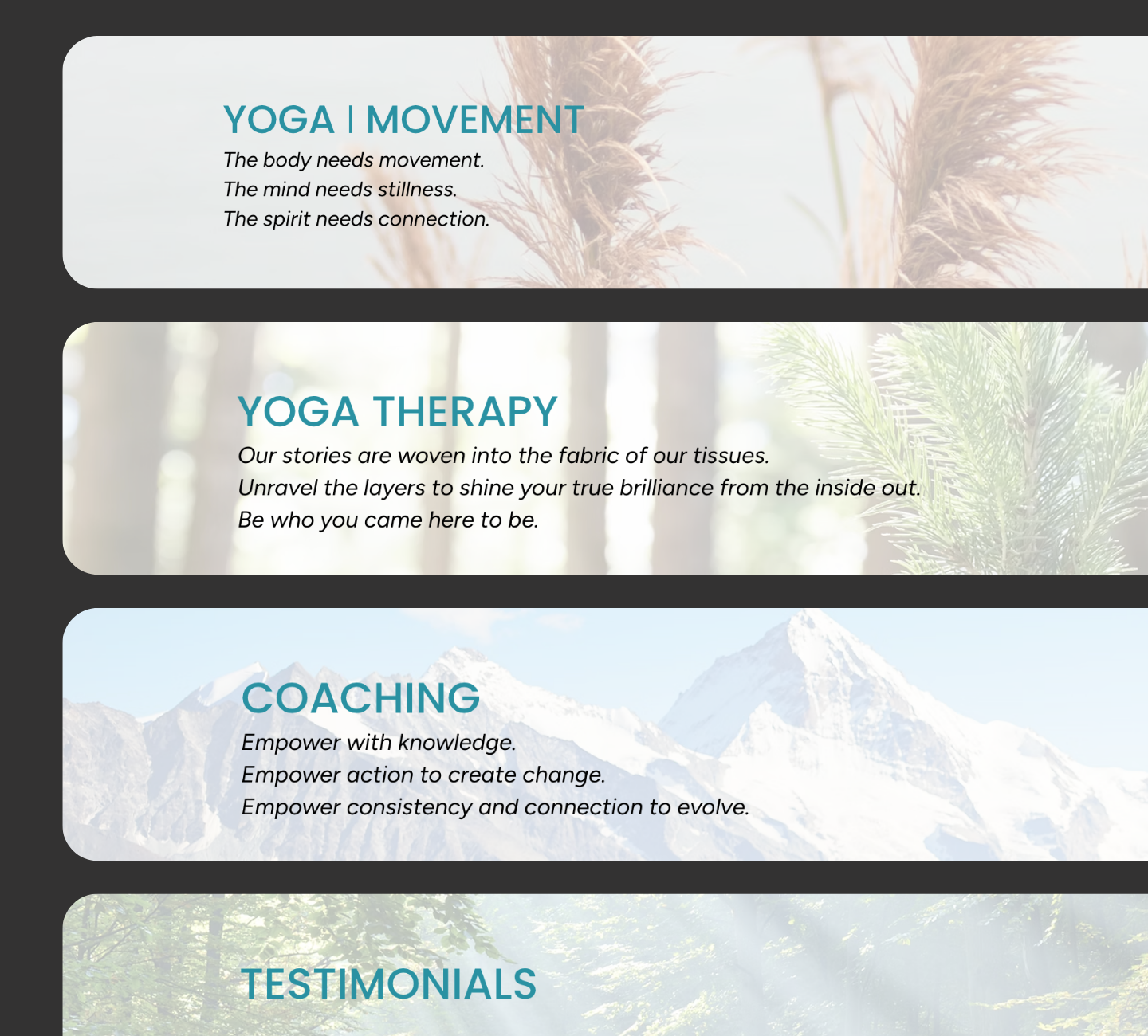
“I felt completely supported at every step. The guidance made the process clear and manageable, and I now have a website I’m proud to share.”
Context
This was an informal website review carried out after the client requested quick feedback on their site. The focus was on identifying clarity issues, improving structure, and highlighting opportunities to make the content easier to navigate and understand from a user perspective.
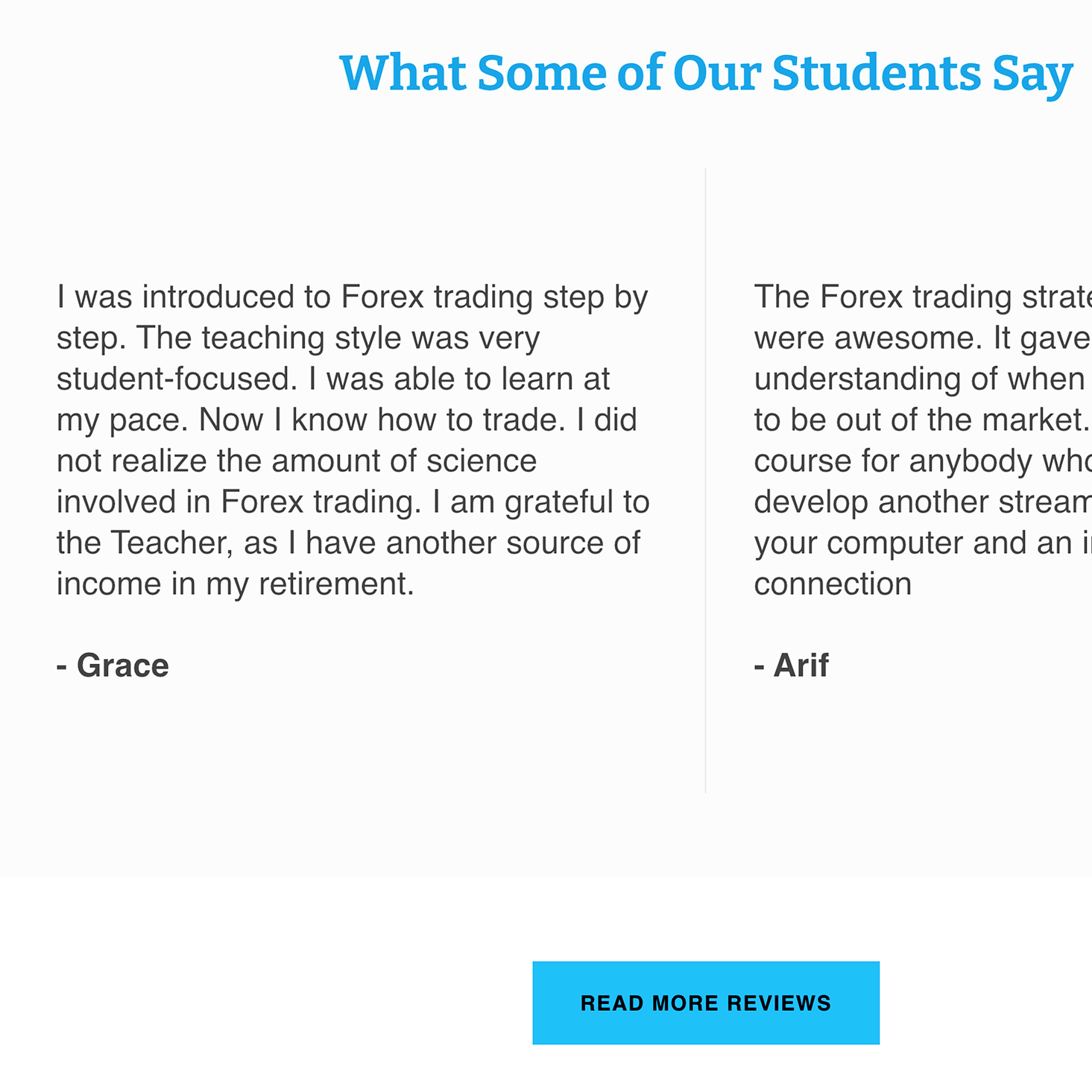
Feedback provided
1. Content clarity
The homepage contained too much text in a single flow, making it harder for users to scan and understand the core message quickly. Clearer sectioning and stronger headings would improve readability and help guide attention more effectively.
2. Structure & navigation
Several structural elements were affecting flow and usability, including FAQs being placed in low-visibility areas and unnecessary pages competing in the main navigation. Simplifying navigation would improve overall clarity and decision-making for users.
3. Visual presentation
Testimonials and reviews lacked visual structure, which reduced their impact. Introducing clearer formatting, consistent styling, and stronger visual hierarchy would improve credibility and readability.
4. Mobile experience
The reviews section was overly long on mobile, creating unnecessary friction. A shorter curated selection with a link to external reviews would improve usability without reducing social proof.
5. Consistency
Minor inconsistencies such as typos and formatting issues in reviews were affecting perceived professionalism. Adding consistency and contextual detail (such as variation in customer types or timing) would strengthen trust.
Outcome
The feedback provided clear, practical opportunities to improve clarity, structure, and user experience across the site. Several of the recommendations were later reflected in updates made to the website.
Website Clarity Review
Private Forex Tutor